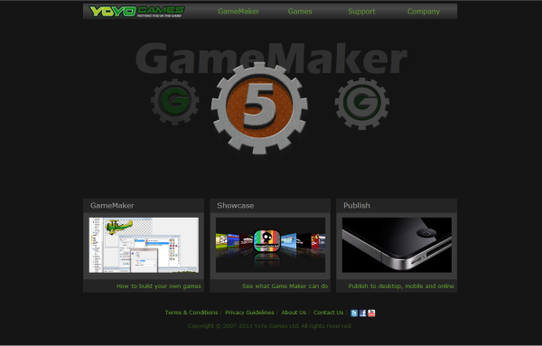
YoYo Games today changed their main website from a large light coloured community-focused homepage to a smaller darker product-focused frontage. We knew it was coming but it is a big change.
Gone from the homepage are the user-created games and adverts, in their place is massive Flash applet promoting GameMaker. What better way to showcase the upcoming HTML5 GameMaker than by devoting the most prominent space on the new homepage to a Flash animation! In response to a question fielded on Twitter Mike Dailly wrote that an HTML5 animation will eventually replace the Flash one in providing links to the various present and upcoming versions of the game creation software as time allows.
The Pages
At the top of the site are four drop-down menus providing access to internal pages of the YoYo Games website.
GameMaker provides access to pages for GameMaker Standard (though this also includes the free “Lite” version of GameMaker 8.1 for Windows), HTML5, GameMaker for Mac and GameMaker Studio. The information on the HTML5 and Studio versions of GameMaker is each limited to a single video which we’ve seen before and a promise that more details are “coming soon”.
Games expands to link to an empty template page under “Showcase”, a Publishing page invites developers using GameMaker to contact YoYo Games with their ideas, whilst “Developer Profiles” features zero developer profiles. “Sandbox” links to the homepage of the old YoYo Games site which has moved to a new location of sandbox.yoyogames.com. Although previously uploaded content is now accessed via a new subdomain, redirects are in place from the old yoyogames.com URLs.
Support starts with “Documentation”. I expected this contain links to download the GameMaker manual in various languages and perhaps the official tutorials but instead it is a rather unnecessary intermediary page on the way to directing users to the YoYo Games Wiki. “Community” provides a gateway to the official Game Maker Community whilst a message on the “Resources” page suggests that we will soon see some new official tutorials and resources to use in-game.
GameMaker is widely used in schools and the dedicated “Education” page reflects this enabling schools to submit an enquiry for site license details. Then comes the FAQ page and links are also given to the Helpdesk and a “My Account” page which displays your GameMaker licence details.
Company displays information about YoYo Games and its founders, a generic “Contact Us” form (which will undoubtedly be misused by many community members!) and provides access to a Press area containing access to promotional material for published games as well as the new News section.

Official Game Maker News
The YoYo Games “glog” has been replaced with a News section on the new website accessible only from a drop-down menu. As yet there is no obvious “this page has moved” message on the old blog but I am sure one will be added soon.
Although in recent months the blog comments section attracted an increasing number of immature look-at-me messages I am disappointed to see that all comments by all users on all blog posts have been deleted. This includes all clarifications to posts and answers to sensible questions that have been made by YoYo Games staff. A cynic might say your games are next!
Discussion regarding future official YoYo Games announcements will now take place at the Game Maker Community where a permissions change means that all forum members are able to reply to forum posts imported from the “glog”.
Sadly this doesn’t appear to have shed the pointless “first!” comments as we already have our, well, first of these.
Interestingly, as yet, a post made earlier today on the new site announcing its launch has not yet made it to being imported to the GMC.
Incomplete
Although the main site design is present many sections of the site are incomplete and are labelled as “coming soon”. The first news article states “that means, they really ARE coming soon” but is followed immediately by “there is quite a lot to cover such as HTML5 and Publishing so please be patient”.
On first testing the 8.1 purchase option I was greeted with a server error message however the start of upgrade process appears if you try now, so it appears that the site is being worked on.
I certainly hope more content does come soon because currently the new site is rather sparse. It is a brave man who decides to flip the switch from a front page covered in games to an empty Games Showcase with previously upload games hidden away behind a “sandbox” link.

There’s no RSS on the new website.
Well done!
Yes there is:
http://yoyogames.com/feed
I think they should of maybe had a trial version of the website before they went public like this with it. It definitely downgrades the professionally of YoYo Games’ image.
A lot of polish is still needed.
One of the first things I noticed was the use of Flash, YoYo Games backing of HTML5 makes this somewhat confusing.
Seems to be a website that is trying to have all the ‘bells and whistles’ but don’t understand how to effectively use them.
I understand that the website is still underdevelopment, I just think this should of stayed in the dark for a little while longer. I’m sure YoYo Games will want to improve this by listening to what the community who USES Game Maker has to say, as it is only really hurting their reputation at the moment.
For all the fuss they’re making about html5, there sure is a lot of Flash on the new website.
Agreed. I really don’t understand WHY they changed the name.
The worst part about their use of Flash? They don’t need to use it. All of the cover flow/carousel animations have been done in JS/HTML5 for years already. Sure, you could make the Flash a back up option, in case the browser isn’t modern, but come on, it does come to question some of the thought processes behind the web development team on this one.
Secondly, once again in regards to the website (and Fred you did allude to this), it still does not come off as professional. At a time when YoYo is exploring all new frontiers for their products, why the site contains awkward phrasing/grammar (just check out the page describing the team members and you’ll see what I mean) is beyond the realm of my understanding. Sure, it comes off as a legitimate enterprise, but in general it feels lackluster for a team that’s been together for over four years now. Don’t even get me started on what they’ve done with the old site.
And the fact that the product is now called GameMaker… I don’t think I will EVER get over this.
Ugh, I can’t stand the new design. Hate the custom font, hate the dark gray, hate the Flash carousel, and hate the Cover Flow style for featured games. Seriously. When you compare a site like this to other sites like unity3d.com, how could you possibly come away thinking that Game Maker might be a better choice?
Even Mark’s old website, with it’s occasional awkward English, made me feel better about my Game Maker purchase. I know that YYG has some really talented people working on the actual Game Maker product – why does the website have to feel like some high schooler’s first web project? *sigh*
On the upside (and on a rather cynical note, I guess), it does make me feel better about my own web design abilities when I see that this is what passes for “professional” in certain circles.
Also, while I’m not against the use of Flash in general, with YYG focusing so heavily on HTML5 development, the use of Flash on the new site (and in very prominent places, no less) is just silly.
And as for the games being hidden away, I think it’s better that they showcase Game Maker more like this, but I do think it’s silly to hide the games altogether. At least show a random selection of games from the staff choice or something – it does nothing but show that some great things can be done with Game Maker. Greater than most, if not all, of the YYG games in the new showcase, anyway.
The demographics are very simple; I sold over 1000 copies of DS Game Maker so I can tell you. All the users are 11 year olds or mums buying for 11 year olds.
This is an ugly site that may appeal to a few adults. But actually, the whole ‘focus on GameMaker’ is not present and the ‘landing page’ execution is very bad, (I quote): “For first time visitors, the landing page should clearly show what we are about, provide enough interest to find out more”. Doesn’t do that.
So you are an 11 year-old n00b. Much as YoYo hates these customers on the site, as I dislike them too, *they are the customers*, *this is the business*. Let us say I am an 11 year old n00b. I eventually find Game Maker under the horrible Flash animation, and the first thing I see is ‘BUY BUY BUY’.
Don’t like the font either, and the code is obviously written by n00bs – look at the comments.
I’ve always been critical (and I’m not a semi-n00b who does it with no knowledge), but recently such criticism has been very justified.
Kind of surprised to see this open already. I was invited to preview the site a week or so ago and at the time I thought there was still a lot of work ahead. It’s better populated now, but I’m taken aback by the lack of integration of the old content. Seems like a major misstep to me.
Cool ! Once the new website is done, they’ll go back working on GM Studio and launch it as soon as possible !!! I’m so eager to be able to compile for html5 and android !!!
Personally I prefer when the visitor has everything under his mouse, on bigger pages (since everybody has a huge screen now), instead of this small thing which makes you think there is far less content than before. But it’s just me.
@Israel RN i strongly agree with all you just said although i love game maker and how yoyo are building on it the fact is yoyogames just dont know what design is and the art and sprites they put in their games give the look of cheap
school project graphics not saying the games are not good but the graphics should be given to a real artist/animator for such a showcase of what game maker can do and what yoyo can too SANDY PLEASE HIRE REAL DESIGNERS AND ARTISTS/ANIMATORS………….
IMAGE IS THE FIRST THING PEOPLE LOOK AT
Not quite ready IMO…
It really seems that YoYo doesn’t get web design at all. I just can’t believe it.
I completely agree with RC: this website looks like a poor mockup someone got done during lunch time.
Why? Do you really think the new website is good? It’s not even a decent one! I’d be ashamed to put such site on my portfolio.
Why do you insist on only showcasing the games you publish instead of talking about the lots of excellent indie games done with GM? No offense intended, but there are much better GM-made indie games released out there, than the ones you’ve published.
Nothing bad with that, I’m not saying the games you’ve decided to publish suck… but if you don’t say a damn word on your website about Super Crate Box, Dustforce!, Climb to the top of the Castle, Tuning (just to name a few), you are losing a lot of credibility. Why are you so stubborn?
Can’t you understand you’re hurting GameMaker, and your bussiness with such actions?
Seriously, Sandy, do yourself a favor and go hire a real digital agency and get them create the kick-ass website GameMaker, YoYo, and all GameMaker developers deserve.
The Good:
+ Ads are gone
+ There’s more emphasis on GM
The Bad:
+ There’s too much emphasis on GM, just to let the visitor down with the shittiest product details page I’ve seen since the 90’s
+ The games are completely hidden… It seems that they completely forgot the “YouTube of videogames” concept.
+ Why on earth would you use flash? You could have accomplished the same effects with jQuery.
The Ugly:
+ Black and gray layout? Really?
+ The new logo looks like it’s done with WordArt
+ The games showcase menu sucks… copying the iTunes cover flip just like the 9,235,245 other (shitty) websites already do?
+ Seriously, are those the best product videos you could create? There are hundreds of better home-produced software tutorials on YouTube. Are you insane?
Anyway, it’s your damn money. Do whatever you want. You have a goldmine in your hands, pity you have no idea how to handle it.
I’m somewhat disappointed to no longer see my featured game on the front page. I suspect game plays globally will be much reduced with this setup. Only time will tell, but I believe it was too early to release this site. A lot of visitors will be left confused on “how to get to the games”.
The validation stuff is all false positives.
I work in web design, and I would not release that site. I’d maybe show it to the client as an example of what it might look like, but nothing more.
Firstly, the overall design is really boringly standard. Content with modules on the right hand side? It looks like a skinned version of the standard WordPress theme. There’s nothing wrong with that, unless you’re a big professional company.
The navigation menus don’t hover correctly, showing an I-bar rather than a pointer. A small thing, but noticeable and unprofessional. In fact, the menus themselves are very jumpy and kinda buggy.
A huge pet-peeve, from the off, is the use of flash. GameMaker will soon be producing games in HTML5, yet on it’s own site it shuns modern web tech in lieu of old, outdated content? Also, that’s the handheld market gone.
The focus, obviously, has completely changed. The old site focussed too heavily on user-made games and not enough on the creation tool, but the new site is all about the product and not about what can be produced. The advertised games don’t go anywhere near covering the mass of content produced, including some truly excellent and original titles.
Really, the new site looks like a corporate backside to YoYo. It’s their advertisement of what can be done with their tool, how great it all is. Alas, this seems to just reduce GameMaker to a tool, a revenue device. It doesn’t look like it’s about indie games any more.
Summary version: it’s a site to look more professional that looks unprofessional and doesn’t advertise about GameMaker what people care about most, the content.
Also, I don’t much care for the slogan.
http://www.youtube.com/watch?v=FPBACTS-tyg
Validation doesn’t really matter just pointing it out, but still it’s nice. If a site doesn’t validate and then doesn’t look proper in other browsers then it’s forgivable.
Also 2 more things I just noticed. Mousing over the GameMaker, Games, Support or Company menus results in an I bar instead of your cursor, which is kind of annoying.
And the background color the flash is using is different from the background color the rest of the site is using…
Interesting video from Matt Cutts thanks for posting the link.
I see the games showcase now in Chrome, not sure if was working all along?
I don’t recall YYG ever hyping the new site up, but then again I haven’t really been paying attention. As for the actual site it’s not that great, it’s definitely an improvement over the old one though.
Oh and the source isn’t what I’d expect from anyone who designs websites “professionally”.
http://validator.w3.org/check?uri=nm.yoyogames.com&charset=%28detect+automatically%29&doctype=Inline&group=0
I also liked functionInHtmlFile().
Hopefully they’re not done with this because it could use a lot of work.
A bit more information on what each “version” I guess, of GM is going to be, right now it’s just a link to a video. Show case feels really weird I expected to be able to mouse wheel through it but nope, had to either wait for it to change (which it shouldn’t be doing in the first place) or click on the next one.
It has less errors and warnings than the Google homepage 🙂
As much as I hate to agree with the community…
YYG hyped this new site up too much, because as far as I can tell, it’s nothing but a fancy little portal.
The site seems like it has been rushed when it shouldn’t have been. There was no reason to release it like this, and if they intend to keep ties with the old site and their own forums, they could have fixed those up instead of releasing this first.
I realize they’re trying to emphasize on GameMaker, but seemingly ditching everything they had really isn’t the way to go about that.
Don’t get me wrong, showcasing products that are on various mobile platforms is nice, but relegating the entirety of the games posted to the “old” website to a sandbox page doesn’t make much sense. There isn’t even a graphic to indicate where to go; you either have to guess what “sandbox” means in this context, or know the new address. Obviously URL redirection exists, but for those just visiting the site for the first time, there is no real indication of a large library of games available on the back streets of the site.
Second! 😛
I hope they make a rule about posting “first!”…
Thx Philip, good article. “First !”
Sandy