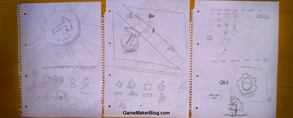
Yesterday YoYo Games revealed the new logo that will be used to represent Game Maker 8. As expected some members of the community have been very vocal in their opposition to it with one petition attracting 500 signatures in 18 hours asking for the logo to be replaced. I expect that between them the signatories have at least 50 different designs which they believe should represent Game Maker.
Sadly the immaturity of some Game Maker users has lead to a YoYo Games staff member being compared to Hitler and the creator of the winning logo design receiving hate e-mails. Clearly unacceptable behaviour regardless of your opinions on the change although I do hope that the people who posted saying that they would never use Game Maker again do leave.
Caught in the middle of YoYo Games’ decision and the abuse thrown by some towards the design is the logo’s creator, Albert Zak. Early this afternoon I spoke with Albert to get some background on his design and his thoughts on the communities reaction to it.
 What was your inspiration for the design?
I mostly worked by the one rule Sandy posted, “to fit better with the YYG branding”. Incidentally, most inspiration came from YoYo Games itself. Looking at their logo and at this page clearly set the art direction. Much criticism was made against the “hideous” mouth, which (as a few pointed out) took maybe a bit too much inspiration from Yahoo IM.
Does your design symbolise anything in particular about Game Maker?
Obviously the logo should represent what Game Maker really is all about. For one part, that’s the smiley face depicting fun – playing and making games is undoubtedly a lot of fun. It could also be seen as representing the word “game” in the name Game Maker. The cog symbolizes the process of creating them, or the “Maker” part in the name.

What program(s) did you use to make the logo?
The logo was entirely made in Adobe Illustrator. I have never used any vector apps before; after reading the initial announcement just three days before the deadline, I decided to download the Illustrator demo and enter the contest. Luckily there are tons of free training available on the internet, it took less than 2 hours of tutorial-watching to make me believe that I knew enough to create the logo.
Did you submit more than one design?
Initially I wanted to redesign the hammer, but later realized there will probably be too many similar entries to really stand out. Sandy then added he was looking for something completely new; so I ditched my hammer designs and went on to some brainstorming. It didn’t take long for the final idea to pop up. I was never 100% satisfied with the execution. Specifically I couldn’t find a way to make the eyes look more appealing, and the text didn’t look good when properly capitalized. I didn’t have the time to think up any more designs, much less to actually make them.

Did you feel confident once you saw the other finalists you were up against?
Totally. I’m generally a pretty confident person (some may refer to this as cocky) still I remained positive all the time. To tell the truth I got even more confident when I saw my competitors’ creations than I was when there wasn’t much known about them. I’m absolutely not saying they’re bad, but I can clearly understand why YYG didn’t choose them as the final logo.
How did it feel when you saw the criticism that was directed at your logo?
Most of the comments were just plain immature and really couldn’t be taken seriously. On the other hand, I loved the originality and great lengths of effort some of the commenters took to express their frustration with not being the winner – there’s even a game aiming to destroy the new logo! I guess nobody, not even Sandy himself, would have expected so much ranting (let’s say “heated discussion”), but eventually everyone will calm down as they realize there’s just no point in childish complaining. I’m however still kind of puzzled why only 8% picked this as their favorite, but I’m glad Sandy and a few others realized what’s really behind this logo. Of course I still feel great about having won and having defined part the future of Game Maker.
Based on the maturity levels I have seen elsewhere regarding the logo sadly I feel it necessary to make it clear that Zak submitted just one of over 500 designs that were entered into the logo contest and obviously did not make the decision that his would be the winning design. Hateful comments directed towards him will not be tolerated.

i whant to make a game with out a zip code or ponoenumber
Great article! it is really helpful for those who want to design logos!
Now I am using this logo maker: http://www.sothink.com/product/logo-maker/index.html
A straightfoward logo maker. Simple, but it really works for me.
the logo designer is an idiot