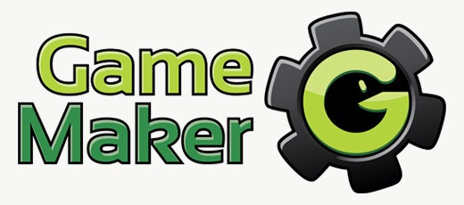
YoYo Games CEO Sandy Duncan has confirmed that a modification of the winning design in the runoff vote to evolve Albert Zak’s smiley will be the new Game Maker logo.
“Here is the new revised logo, based on the original design but with no smiley and a few other changes (note….this is an ironic statement on my part) , designed by and voted for by the GMC.
Before I start taking too much credit for a slight change of plan (self mocking irony again) , I want to make sure that full credit for organising this is due to @FredFredrickson.
Your comments (good and bad) are welcome, but I want to be very clear…..we’re NOT redesigning it again….THIS IS IT !”
-Sandy Duncan, YYG blog


mm.. looking even better than the previous one. Nice =)
I really enjoy the new logo. Still see nothing wrong with modernizing the old logo, as Apple did. However, I like this new logo a lot but do prefer the font for the words “Game Maker” that they used on the last logo.
Thanks to sandy for listening to everyones comments. We shouldnt complain anymore, we got what we wanted. this logo fits rather well with GM (it has YoYo’s colors, and GM vets will notice the pac-man is a reference to the D&D sprite functions. and the G is obviously for game) plus it looks twice as proffesional as the last.
Anyone who’s still complaining is complaining for the sake of complaining. The wars over guys, we can go back to a normal (internet) life.
I have to say I prefer this one to the happy face, but I still think this one needs work. Unfortunately the original winning logo looked too unprofessional and cheesy, and I was concerned that It would cost YoYoGames not just a lot of money, but also a lot of the Game Maker community. I feared it would have given the impression that Game Maker is just a kid’s toy to fool around and have fun with. In that regard, I am glad that Sandy finally agreed to change it.
The biggest problem I have with the new logo is the font, and the font colours. I don’t feel that the font really captures what Game Maker is all about. I also feel the black border around the letters is a bit dated (not really up to the current logo design standards), and the colour for the ‘Maker’ text is a bit off. What I mean by this is that the green colour does not complement the green in the rest of the logo very well.
The other problem with the logo is that it can’t be placed on dark backgrounds which may be problematic in some cases. This may be a matter of opinion, but I would prefer it if the cogs on the wheels were not as curvy/bubbly as they are now and I personally think the area behind the G (the pacman) should not be solid black since the rest of the logo makes use of gradients, glossy effects, highlights and shadowing.
What I like about the new logo is that it
– Makes use off YoYo Game’s Green Colours
– Incorporates the ‘G’ (for Game Maker) into the graphic portion of the logo
– Manages to disguise a pacman figure within the letter ‘G’ of the graphic logo
– Uses the gear wheel, a commonly accepted symbol for (software) development
I’m glad this one wasn’t designed by a crackhead.
I have a transparent PNG and the AI file if anyone needs it. I made the image on the glog from that.
I aprove our new fuhrer. The smiley was nice.But this is ideal. Hai PacCog!
@Timoi correct, YYG have not provided a transparent version of the logo. Originally I used the version as on YoYoGames.com but thought it looked a bit strange with the grey background. http://gamemakerblog.com/wp-content/uploads/2009/12/final-game-maker-logo.jpg
@Joeri
I thinks that is just because Phil converted the JPG that was on the Glog to the transparent PNG that is on here, and it appears it was a bit of a rough conversion.
The image on the Glog looks much smoother: http://glog.yoyogames.com/wp-content/uploads/2009/12/gm8_logo_glog.jpg
@Mattthew_H
Did you honestly like the old GM logo?
When I heard Sandy wanted a new logo, I was happy and I totally agreed with him – I didn’t expect the winner to be a hysterical smiley face.
Lot better, although this render seems to lack anti-aliasing (pixelated edge).
unfortunately, the new logo disappears on black backgrounds 🙁
Still think the green runner ups would have bee more suited, but it’s an improvement either way. Now if only the text…
I’m happy to see how this turned out, and I’ve regained my trust in YoYoGames.
I still don’t get why we couldn’t just keep the original one. Why does Sandy have this hate of the original GM logo?
Also, I agree with Broxter, the one on the other post looks better. Although it isn’t bad.
Thank you guys! This is a huge improvement 🙂
I’m glad that the entire debate over the design got organized and ended up producing something that was genuinely better.
Much better, I like it.
wow! I really love it!
This loosens a huge knot in my stomach.
Too bad he didn’t mention those who made the new logo by name!
I don’t like the font still, but it’s not a big deal. The logo is what we’ll be staring at mostly for the next few years.
Apart from the fact it’d never work as a cog as the teeth are too wide, I have no problems at all with this logo. I really like the stylisation they added to it as well.
I still wouldn’t’ve minded Zak’s design in the slightest, but I can say I prefer this version to get all the repetitive, empty comments out of the way for good.
On the subject of the Pacman and copyright infringement – I highyl doubt Namco would be successful if they tried it. The fact there’s a gap around his nose area – since there’s a gap in the G it breaks the shape up.
I wish it didn’t have the cog.
It wasn’t the one I really wanted to win, but that doesn’t mean I don’t like it. I think this lighter version is more visually interesting than the dark one first submitted. It still contrasts the green quite well, and it now fits in with the gloss.
I’m pretty satisfied.
To be brutally honest, I preffered how it looked in the previous post (here, on GMB). The lightened shines take away the cool edge, in my opinion. Also, the black inside of the cog contrasts too greatly with the cog, compared with the dark grey of the previous iteration of the logo. Also, as Jesse Venbrux pointed out on the glog, the cog is slightly innaccurate.
But, yeah, it karate-kicks that smiley logo right in it’s fat gob.
My favorite of all the logos I’ve seen won at the end 🙂
Zak’s logo wasn’t that much similar but the basics are there…
Everybody happy now?
Nice to see you not minding Albert, I know I would have been mildly bugged if I had won and then they changed it. (Though with all of the big fuss maybe you welcome the change just to be done with it?)
It’s a great logo with the subtle pac man hidden in it. My only suggestion would have been they stuck with the darker one rather than lighten the cog like they did. (once again heading more cartoony)
Still… Super happy to see it changed.
I believe Sandy/YoYogames and Fredfredrickson and the GMC mods/admins all deserve a round of applause for this.
-Elmernite
Cool. I do quite like it, though I wouldn’t have any problems if my hideous smiley didn’t get changed at all. 😉
At least this one shows some actual depth to it. It isn’t perfect, by no means, but it suites the concept better then the first redesign which looked more like a rip from Yahoo!
I like it 😀 Better then the previous one 🙂
I never had much of a problem with the smiley one, nor do I have a problem with this one. They both capture what GameMaker is all about.
Better one. But “Maker” word color is ugly.
This makes me so happy.
Still has that hammer, I see.