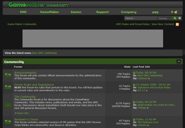
YoYo Games have updated the default forum skin at the official Game Maker Community. The new, much darker, theme is pretty much a complete overhaul and features a grey top navigational bar similar to that introduced on the main YoYo Games website last month.
Whilst the most apparent change is the jump in colour-scheme from green and white to grey there are other noticeable changes with a new GMC logo and post icons.
There are also some pretty major problems – the most important one being that the new theme does not have a login form or direct link to login anywhere on the main page. The register link is missing as well. These links are absent as the page source code indicates they are constituents of the grey top bar, which is supposed to function as a drop down menu, which does not work.
Don’t like it?
Forum moderator tangibleLime writes that “in a week or so” a topic will be opened in which forum members can share alternative forum themes compatible with GreaseMonkey.
I’m not a fan of light-on-dark designs – they strain my eyes – so was pleased to see that it is still possible to revert back to the previous design. The theme switcher at the bottom of the page provides options of “YoYoGames” and “IP.Board Mobile”. Switching to mobile and then back to “YoYoGames” brings back the green theme which was in-use until earlier today.
The last major GMC refresh took place in June 2010 alongside a much needed update of the Invision Power Board software used to run the forums. Prior to that the forum was mostly blue.

There’s actually been studies showing that white on black is more strenuous on the eyes. But don’t expect YYG to understand that. According to a post from Mike Dailly a lot of this is due to YYG trying to aim for a more “professional” look. Which, to me, is funny because the new site and theme look even more childish than before. The old site had a lot of problems but it’s not like it looked unprofessional. But to be honest, the last thing they need to be worrying about is their theme or website, it’s their product. But again, don’t expect them to understand that.
I still have that one GMC Skin fixer someone made ages ago. Not so pretty anymore now is it? 😛
http://img171.imageshack.us/img171/8109/gmco.png
The people at YoYo Games have absolutely no sense of style! The website looks horrible, as if made in 1995, and now the community forums got the same treatment. Seriously now, I know they’re mostly programmers, but they really need a designer. A real one!
But when they understand it?
Fine then; forget what I said. You’re all fucking geniuses, aren’t you?
I cannot say for the others, but yes, I am.
You need to remember, that there are ‘programmers’ and programmers.
I don’t like dark background on websites because for example images are usually made for white background, and on dark one they can look ugly (especially transparent PNG and GIF which can show some glitches). Also changing background color after website is working several years can give some issues – imagine that some people used gray color for some posts text, to write something less important – now it will be not visible at all on website… it’s not bad if website have dark bg from beginning, but changing it when there is 2 500 000 posts is VERY BAD IDEA because some content can become unreadable now.
YYG should hire better designer for sure…
Fairly sure Jack was referring to the design, rather than the development environment having dark backgrounds.
Is there anyone on the face of this planet that actually uses the Hello Kitty theme? I set it to if for all of 10 seconds and my eyes start watering.
I haven’t seen a programming tool that defaults to light-on-dark since I programmed in qbasic for my intro to programming class (Which I admit, was more of a white-on-light than anything else).
-Elmernite
“I’m not a fan of light-on-dark designs — they strain my eyes…”
Interesting, seeing as most programmers tend to use dark backgrounds when coding rather than black-on-white.
Do they? Both the GM editor and my C++ IDE are black-on-white?
As are the default settings in Netbeans, Notepad++ and cPanel code editor.
When you use the word “most” when referring to a group of people, make sure that you are taking into account “most” of the individuals that make up that group. I have yet to meet someone who programs in a white-on-black font, in fact it is the exact opposite of what the population is use to doing in a natural way (pen is black, paper is white). The last time I worked in a “dark” setting of programming was in DOS…have we regressed to that point in society again?
I think it’s time we move on to big-boy fonts, and put down the crayons.
Huh, I thought everyone used the Hello Kitty theme in Notepad++.
Useless change… Yoyogames, please hurry up with GM Studio instead of wasting your time (and mine) !!!