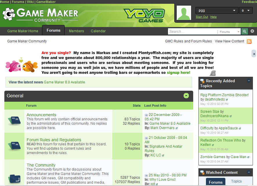
The Official Game Maker Community is expected to be upgraded to a recent version of the Invision Power Board software next week.

You can preview the new software and template at http://testgmc.yoyogames.com/. As well as the new design there are also features adding the ability to connect a Facebook or Twitter account to your profile. The preview is not up-to-date with the latest forum posts and you cannot post.
And yes, adverts.

Wierd, my profile info was reset. Oh well, doubt anyone read it anyways…
“Melissamercy”, post #32, copied a portion of my post word for word, and their name links to an online casino site. I think it’s safe to say it’s a bot. Just letting you guys know.
Thanks. Hadn’t noticed that it was just a C+P.
Personally, I’m not bothered about the adverts. After all, I do have ad-blocking on all websites except GameMaker Blog. 🙂
Why do people keep complaining about adds? If you don’t like them, block them http://adblockplus.org/en/
Thanks for the tip about hiding the “Recently Added” bar Chronic, it makes the place look much tidier.
It’s really strange, I don’t see any ad unless I’m logged out. And I’ll always stay logged in. I can see the ad on the screenie, but not on the demo.
Strange, can’t think adblock or anything would effect only logged in pages. I am logged in atm and still get the ads.
I don’t have an adblock though. That is the strange part…
I also wonder how they manage to maintain their Google AdSense contract — one post (and report to Google) of pornography on the forums and their account will be cancelled. I look forward to seeing how long the ads last.
So GMC upgrade? What do we gain — A terrible color scheme, ads, and squashed content. Fantastic. Isn’t that just your favourite type of ‘upgrade’? I’m disappointed by this.
I was looking forward to an upgrade to IPB3, but it isn’t looking too hopeful at the moment.
Could be worse. The only thing that really annoys me is the washed out white version of the GMC logo.
If the ads were not on the side I’d be fine with it.
The one at the top is the only one I really dislike.
It makes me want to cut myself… But seriously. It’s a tad on the disgusting side.
I’m not sure if I’ll ever want to visit the GMC again with those Ad’s in place.
Those colors look terrible. I’ve got nothing against Mike Dailly, but if he’s going to choose the colors, he might want to learn some of the basic color concepts.
After quickly googling a few articles on choosing website color schemes, I found an applicable one: http://www.pallasweb.com/color.html. Here are a few quotes from it:
“Many websites today clearly reflect the negative effect of bad color choices. People often choose colors to ‘dress-up’ their site without any regard to their site’s objectives.”
“Here are several mistakes commonly made in selecting website colors: […] The web site uses saturated background colors that fight with your site’s content and make it difficult to read and navigate.”
The only big problem I have is the “stripey” layout of topics – alternating between two colour schemes.
Oh, and the fact that advert is insinuating I want to get it on with a fish.
I just don’t like the coloring because it looks like some weird lime-green plaid picnic blanket.
Hey Andrew! That ad was targeted at me not you…
Well, I was a little harsh at first. It isn’t aweful I guss.
But I still prefer the old one.
If you read GMDigest, Mike Dailly seems absolutely adamant about making GMC green, much like Sandy Duncan’s pathological hate for the GM hammer logo. I’m not holding out much hope for a big change to the look, but I do pray that the more subdued design tangibleLime came up with is a selectable option eventually.
This is sort of like how the users handle facebook changes. Everyone complains for the first couple of weeks or a month, and then people just forget about it and get used to it.
That being said, I’m gonna hate this change >_>.
Don’t like it. A skin change is OK, and if it changes further then good, but from the preview it’s less widescreen friendly which is bad for me.
No. The Ad’s :\… I know every site has ads, but what i loved about the GMC was that it doesn’t. Don’t take this as a very whiney comment, i’m just trying to state my opinion. Also, everything seems kind of scrunched up now, personally i liked the old layout more. Skin, well thats been discussed. Maybe having an option to convert to the old skin would be nice ^_^? I’ve seen it done on other sites, but i have no idea how to do it, just a suggestion.
And there’s no point even making suggestions, because from past examples we can see YoYo Games are unlikely to change it any time soon. 😐
Some of the mods have been pushing for a skin change, and someone actually posted a very nice screenshot of one recently in the mods forum, so hopefully we’ll have something better than this thing eventually… because I agree – the default skin it has now is fugly.
Not a fan.
As i said, we’re not responsible for the skin design, just the color edit. That aside, the Recently Added bar can be hidden by clicking the X found under the RSS feed icon as seen in the top right corner of the image.
The colors aren’t bad, it’s how they’re handled. It looks like someone just thought if they put as many shades of green in as possible,it would look alright. There’s no real attention paid to making it aesthetically pleasing, just information overload.
My suggestions would be for a more subdued colorscheme, like the previous one. Use the company colors for the main headings, and a few other well-placed accent colors, and make everything else white, black, or desaturated greens and blues.
I also like the convenience of the “Recently Added” and whatnot, but those boxes need to be somewhere else. They look terrible there, constrain the main content, and contribute to information overload. At least on my resolution, after “Recently Added” and the side ad, there’s a collumn of unused space which just looks awkward. Maybe they should give those things their own pages, or put the info at the bottom of the main index next to “Who’s Online”.
EDIT: I left this window open for a while, so I didn’t see Chronic’s post until after I made mine. Noting that it was forced early and will be revised, I can understand most of the problems. I still think some of the suggestions would be nice, though.
You need to keep in mind that we’ve been forced to upgrade early, so the skin is not yet finished. We certainly plan to develop it more (though i’m not sure how much of it will change).
As for the adverts, sigh… seriously. If you’ve been living under some type of internet rock, you’ll see that many many other sites also have adverts, even this blog. I’m sure in a few days you’ll not even notice them.
I have never seen banner ads on forums belonging to commercial development tool makers or commercial game makers. Just sayin’.
One of my top 3 reasons for loving the GMC is lack of ads. I don’t think I’m going to be hanging around so much =(
The design looks decent, but in overall it’s far too crowded.
(And Facebook “like” buttons? Seriously?)
I don’t like it at all. I don’t mind the adverts (if they aren’t too annoying though), but its way too bloated and I don’t dig the Yoyo Games color design for the forum (the older one also had it, but it was a lot less “greenish” and it had more color distinction for each element).
Hooooooly shamoly. Ew ew ew. Totally agree with SunnyKatt. It’s just… a mess. Like the YYG forums… Eeh, it’ll probably grow on me. 😛
I don’t like it. The old design was so simple and nice, this is a complicated and shiny mess.
That thing is hideous
Ads? Seriously? I can understand them being on YYG, but on the GMC?
I’m gonna hate this update…